Project Spotlight
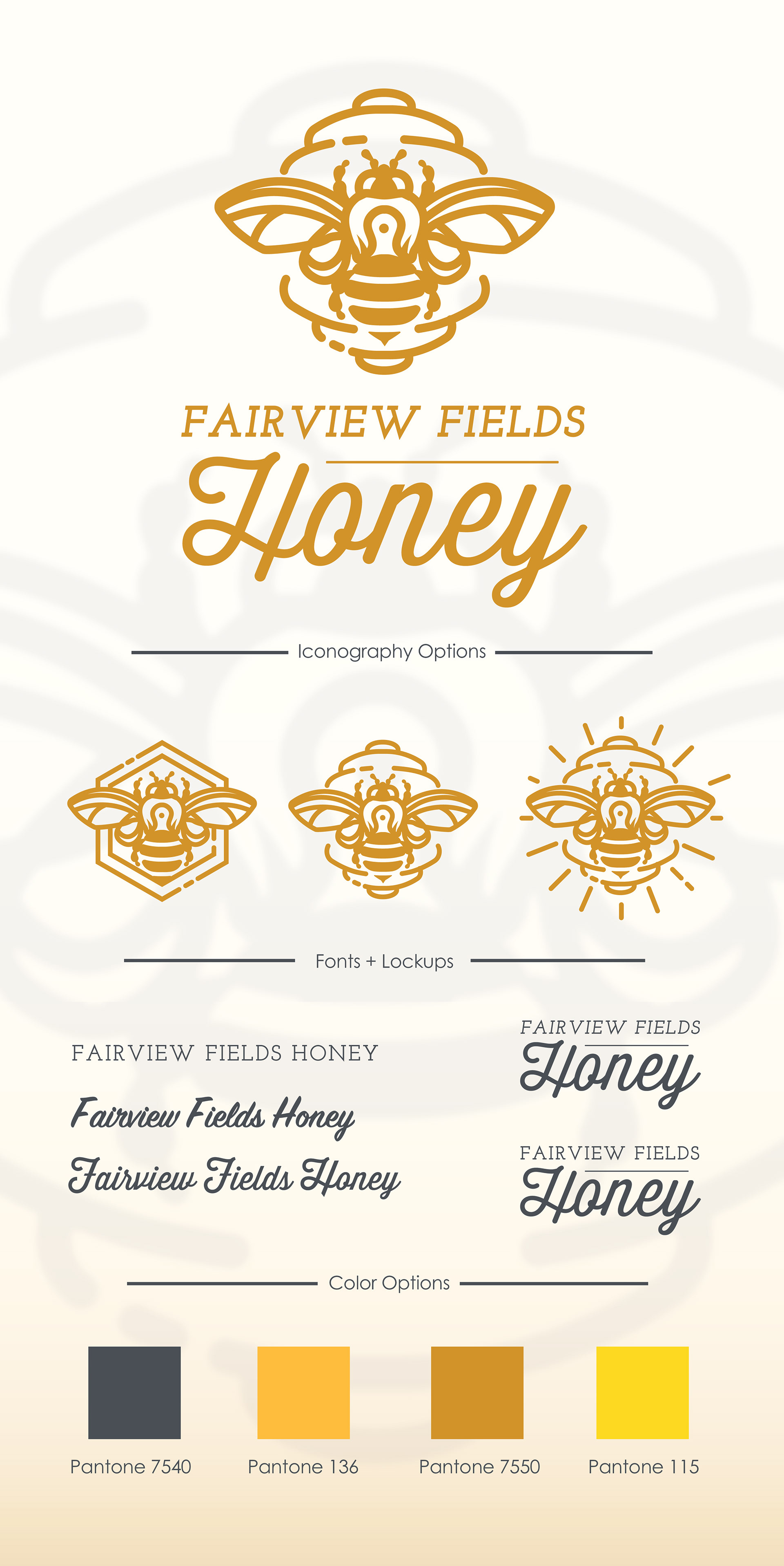
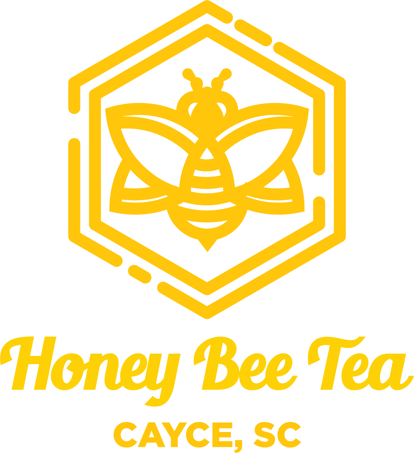
Fairview Fields Honey Branding
Client: Freelance
Role: Logo Designer
Deliverable: Logo & Brand Assets
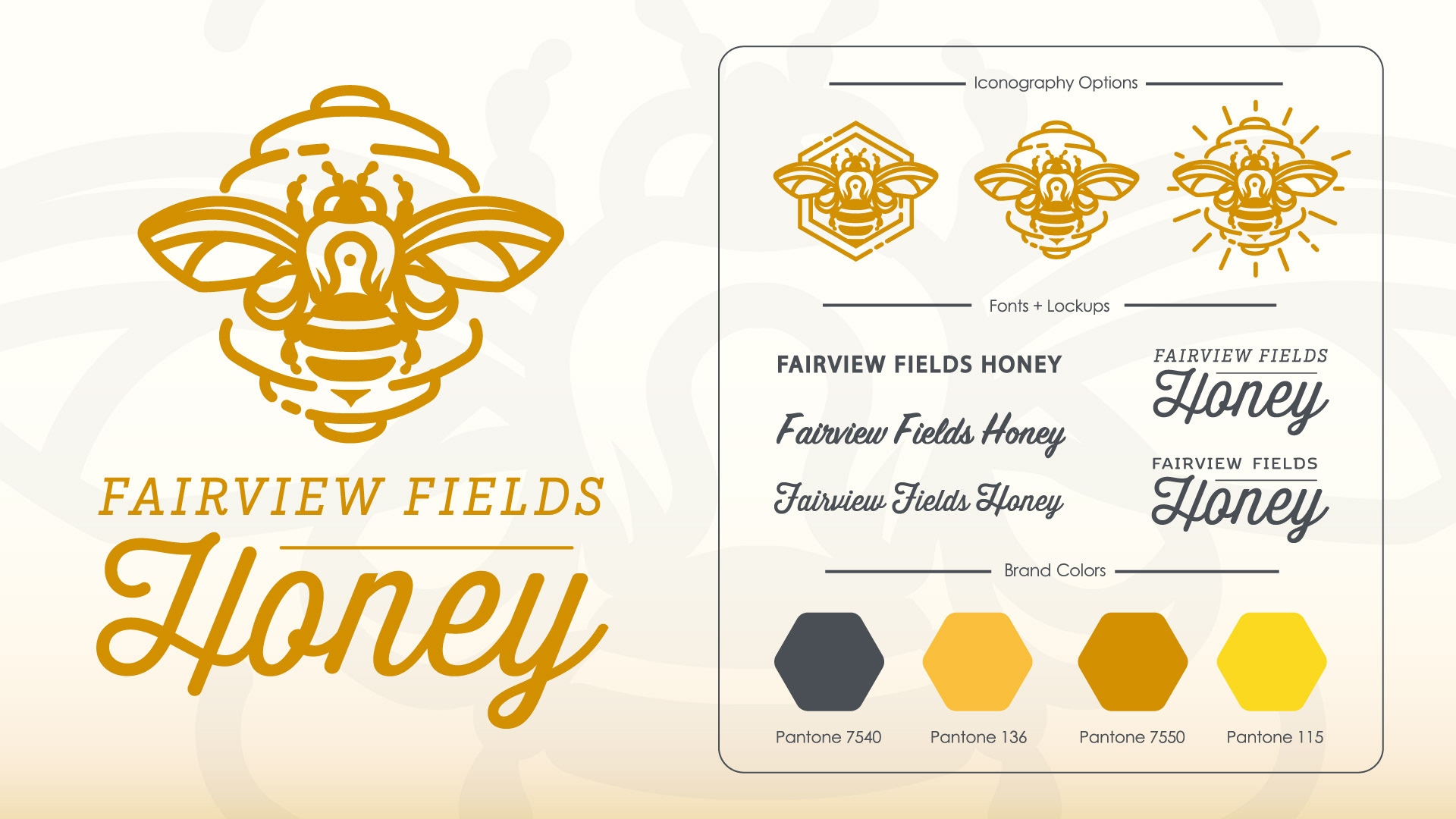
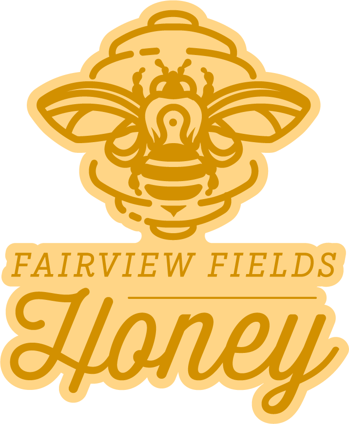
Fairview Fields Honey is a North Carolina-based honey producer. The bee mark was built using Illustrator's shape builder tool, balancing geometric construction with an illustrative finish. Three icon variations were developed for flexibility across packaging, signage, and digital use.
The type pairing sets a condensed sans-serif against a script, with the palette built around a core amber gold (Pantone 7550), supported by a lighter gold, a bright yellow, and a charcoal neutral to anchor the system.

Additional Projects

RNMC Logo Redesign
Fairview Fields Logo Design

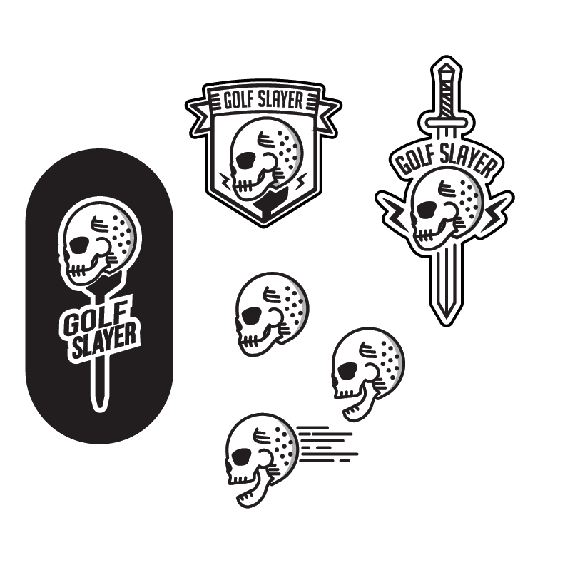
Merida Mexico Destination Sticker Design

AeroWorks Logo

Duke's Pad Thai Columbia, SC Logo Design
Dunnwellness Spa & Wellness Logo Design


Art Direction & Branding